How to Design a Total Rewards Statement Employees Can Actually Follow
Most total rewards statements get opened, skimmed for salary and closed. The problem is rarely the content. It is the design, structure and language.
A total rewards statement that no one reads is not a total rewards programme. It is a PDF filing exercise. The document exists, a box gets ticked, and the employee's perception of their compensation remains exactly where it was before the statement was sent: incomplete, probably understated, and definitely not working in the employer's favour.
The frustrating part is that the information in most statements is fine. Companies are capturing salary, benefits, variable pay, equity, employer contributions. The underlying data is there. What breaks down is the way it is presented. Statements get written in the language of HR systems rather than in language a person actually reads. Components are ordered by how they sit in the payroll file rather than by what the employee cares about most. Numbers are shown without context. Benefits are listed by policy name rather than described in plain terms.
Fixing this is a design problem, not a data problem. The content doesn't need to change. The structure, the language, and the visual hierarchy do. What follows is a practical guide to what that looks like.
Why statements fail on page one
When HR teams are asked why they structure total rewards statements the way they do, the most common answer is that they followed a template, or they built on whatever the previous team had created. Very few statements are designed from the employee's perspective. Most are designed from the HR team's perspective, which means they reflect how compensation data is organised internally rather than how a person who is reading their own package wants to encounter it.
The result is a document that leads with items employees already know well, such as gross base salary, before getting to anything that changes their picture of the total package. By the time the statement reaches equity, benefits contributions, or the total employer investment figure, most employees have stopped reading.
AI at work: reordering content based on what each employee is most likely to read first. AI-assisted platforms can analyse employee profile data and engagement history to personalise the section order in each statement. A senior engineer with unvested equity sees the equity vesting schedule prominently. A new joiner whose onboarding questions were mostly about health coverage sees benefits first. The underlying data is identical; the reading experience is optimised for each person. This kind of dynamic ordering is not feasible manually at scale, but it is table stakes for modern statement platforms.
There is also the problem of jargon. "Employer EPF contribution," "gratuity accrual," "group medical floater sum insured," and "LTA tax exemption" are accurate descriptions of real benefits. They are not descriptions that most employees can immediately connect to a monetary value in their own lives. A statement that uses these labels without translating them tells the employee what their benefits are called, not what they are worth. Those are two different things.
Six design principles for readable statements
These are not aesthetic principles. They are structural choices that determine whether an employee reads through to the total package figure or abandons the document halfway through the benefits section.
1. Lead with the total, not the components
The headline number, total annual employer investment, should appear on the first page, ideally in the first half of it. Most statements bury this figure at the end after walking through every component. Employees who see the total first are more motivated to read through the breakdown of how it was calculated.
2. Order components by employee salience, not payroll logic
Base salary comes first because everyone expects it, but after that the order should reflect what the employee is most curious about, not how the HRMS exports data. Equity and variable pay before provident fund line items. Benefits summary before gratuity calculations.
3. Translate every benefit into an annual rupee or currency figure
Sum insured is not a value. A monthly premium is not a value. The annual employer contribution to the employee's health cover, stated as a specific figure, is a value. Every benefit needs a number that represents what the employer spends, not the policy terms that describe what is covered.
4. Use plain language for section headers and benefit names
"Health and life cover" is clearer than "Group Medical and Term Life Insurance Policy." "Company retirement contribution" is clearer than "Employer EPF and NPS statutory contribution." The content stays accurate; the label becomes something an employee can immediately understand.
5. Include a market comparison, even a simple one
Showing where the employee's total package sits relative to the market for their role and level answers the question that every employee is actually asking when they read a statement. A percentile marker or a brief benchmark note does more for trust than any amount of additional benefits data.
6. Keep it to two pages or three screens
A statement that is too long does not get read. If the underlying data requires more space, create a summary view that links to a detailed view rather than putting everything in a single document that nobody finishes. The goal is that every employee reaches the total package figure, not that every component is documented somewhere in the file.
What the numbers say about readability
The gap between a well-designed and a poorly designed statement is not marginal. Organisations that have invested in statement format report large differences in comprehension, satisfaction, and retention outcomes.
- Many employees say they do not read past the first section of their total rewards statement when it is text-heavy and unstructured (source needed).
- Employees who receive a clearly structured visual statement report much higher satisfaction with their compensation than those who receive a standard text document (source needed).
- Most HR teams admit their current statement format was not designed with the employee's reading experience as the primary consideration (source needed).
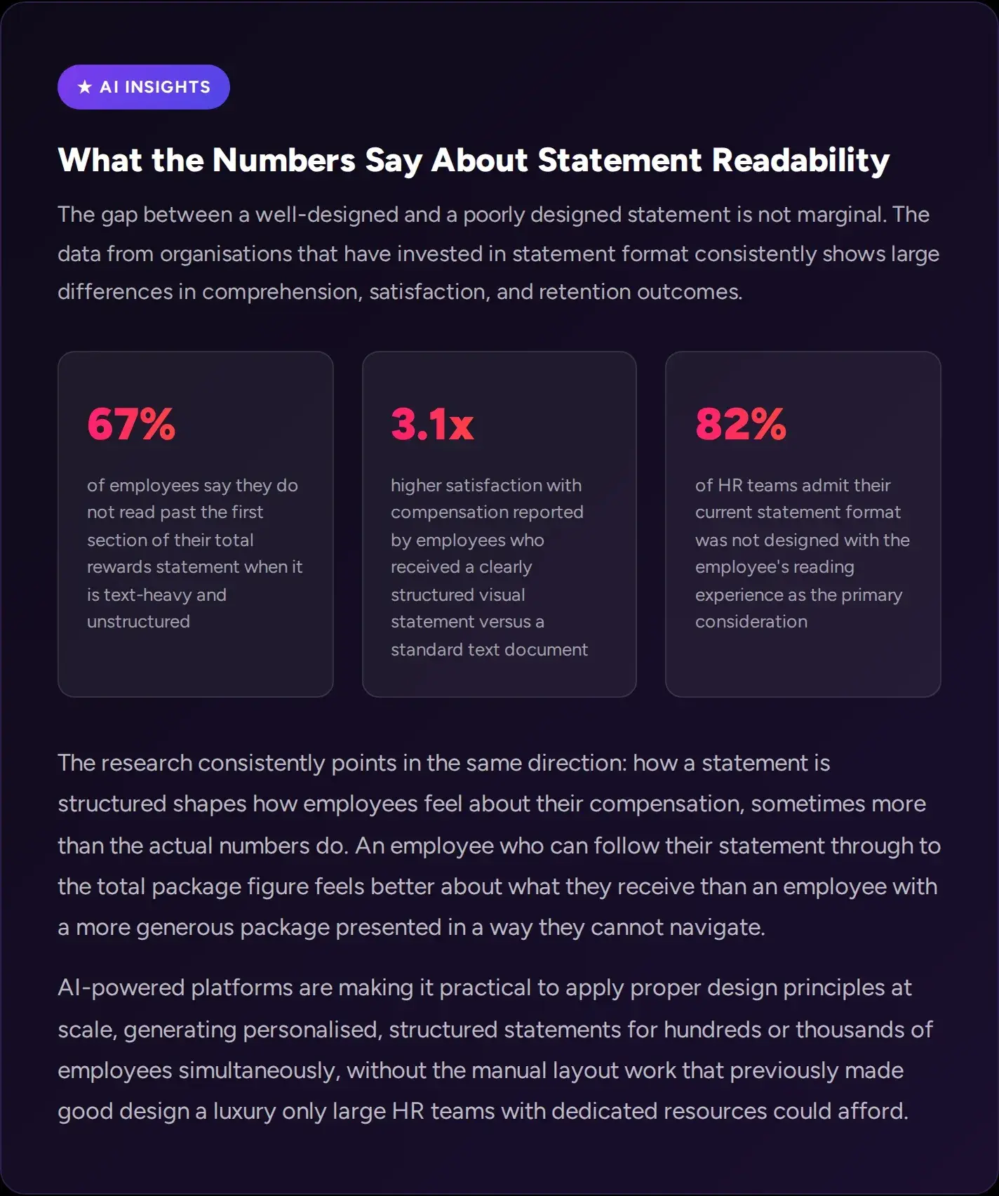
The research consistently points in the same direction: how a statement is structured shapes how employees feel about their compensation, sometimes more than the actual numbers do. An employee who can follow their statement through to the total package figure feels better about what they receive than an employee with a more generous package presented in a way they cannot navigate.
AI-powered platforms are making it practical to apply proper design principles at scale, generating personalised, structured statements for hundreds or thousands of employees simultaneously, without the manual layout work that previously made good design a luxury only large HR teams with dedicated resources could afford.

Presenting variable pay and equity
Variable pay and equity are two of the most valuable components in any compensation package, and they are routinely the least well-presented. This is partly because they are more complex than base salary, and partly because HR teams sometimes avoid being specific about numbers that feel uncertain or subject to change.
But uncertainty is not an excuse for vagueness. Variable pay should show the at-target amount, the performance range, and what was actually paid in the last cycle. Three numbers, clearly labelled. An employee who sees all three knows what they should be aiming for, what is possible, and what happened last time. That is useful. A single line that says "performance bonus as per policy" is not.
Equity needs a vesting schedule, a current value marker as of a specific date, and ideally a simple visual that shows what is vested, what is pending, and when. Employees who cannot see their unvested equity position in a clear format tend to undervalue it, which is a common reason why employees with significant unvested stock still accept competing offers (source needed).
AI at work: turning equity data into a readable vesting timeline automatically. Converting raw equity grant data from a cap table into a readable vesting schedule with current value annotations is a task that previously required either a dedicated compensation analyst or a custom template maintained by the HR operations team. AI-integrated platforms pull the grant data, calculate the current annualised value using the latest share price or valuation, and generate the visual schedule as part of the statement, without anyone on the HR team opening a spreadsheet.
The same principle applies to benefits that vary by employee or that employees can partly choose themselves. A flexible benefits allowance, a meal or transport stipend, a learning budget that the employee controls: these should show both the total employer allocation and what the employee has used, so they can see the value they are capturing and the value they might be leaving on the table.
Format choices that make or break a statement
These are the specific decisions that most often determine whether a statement communicates clearly or quietly undermines confidence in the package.
Do this | Avoid this |
|---|---|
State the total employer investment as the headline figure on page one | Bury the total at the end of a multi-page component breakdown |
Express every benefit as an annual monetary value in the employee's currency | List benefits by policy name or sum insured without a cost figure |
Include a market percentile or brief benchmark note for the total package | Show compensation numbers with no external reference point |
Show variable pay with three figures: at-target, range, and last year's actual | Reference the bonus as "performance linked, as per company policy" |
Present equity with a vesting timeline and a current value as of a stated date | State only the grant size with no indication of current value or schedule |
Use plain-language section headers the employee can immediately understand | Use internal system labels like "CTC components" or "statutory deductions" |
Include year-on-year change so the employee can see package growth over time | Show current year data only with no historical comparison |
Caption: Format choices above are illustrative. Adapt based on your organisation's compensation structure and applicable regulatory context.
"Employees do not distrust their employers because the data is wrong. They distrust them because the data is hard to follow. Clarity is the credibility."
Where employees look first
When you understand how employee attention actually moves through a statement, the design choices become obvious. Attention is not uniformly distributed across the document. It concentrates at the beginning, drops sharply after the first two sections, and may recover briefly at the total figure if the reader makes it that far.
Employees rate these elements, from most to least important, as driving their sense that a statement is useful and credible (source needed):
- Total compensation headline figure
- Plain-language benefit values in currency
- Market comparison or benchmark reference
- Visual breakdown of package components
- Year-on-year change clearly shown
- Equity vesting schedule with current value
- A note or message from their manager or HR
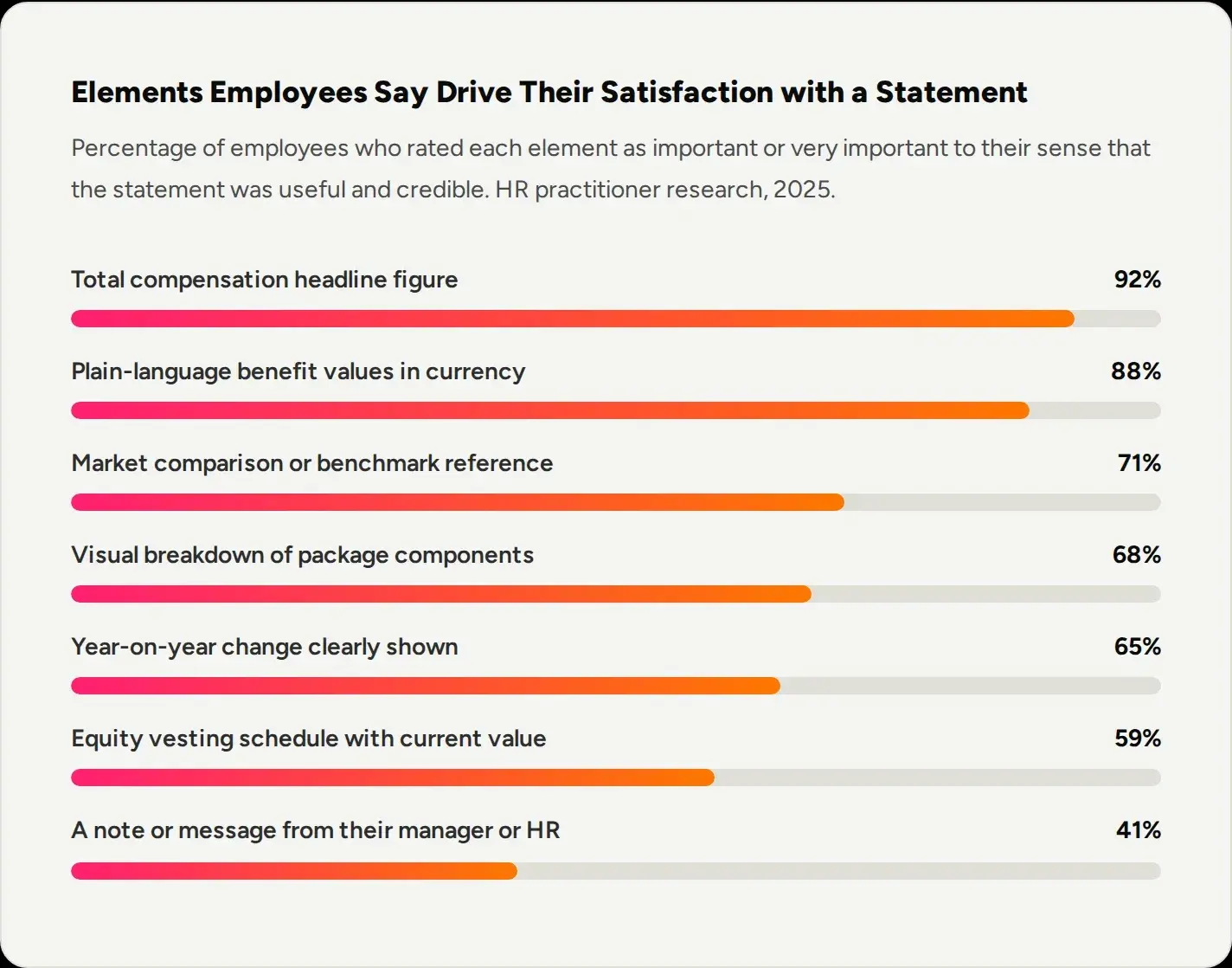
The pattern is clear: employees want the total number, they want benefits expressed in money they can understand, and they want to know how they compare to the market. Everything else is secondary. A statement that nails these three things is more valuable than one that includes ten components in a format nobody can navigate.
AI at work: generating plain-language benefit summaries from raw policy data. One of the most time-consuming parts of building a good statement is translating benefits policy data into plain-language descriptions with accurate monetary values. An HR team managing thirty different benefit schemes across multiple office locations has to calculate, verify, and write these descriptions individually if they are doing it manually. AI-powered statement platforms automate this step: they pull the benefit parameters, calculate the employer contribution for each employee's specific plan, and generate a one-line plain-language summary that is ready to include in the statement without additional editing.
Frequently asked questions
Should the total package figure really appear on page one before the components?
Yes, consistently. The most common counter-argument is that employees might focus on the total and not read through the breakdown, but the data suggests the opposite: employees who see the total first are more likely to read the components because they want to understand how the number was reached. Burying the total at the end, which is the default in most statement templates, means a significant proportion of employees never see it at all because they stop reading before they get there.
How do we handle benefits that vary by employee choice, like flexible benefit allocations?
Show both the employer allocation and what the employee has used. A flexible benefits allowance of Rs 60,000 of which the employee has claimed Rs 38,000 tells a more complete story than simply listing Rs 60,000 as a benefit value. The employee can see what they have and what remains available. Where a benefit is entirely at the employee's discretion, show the employer allocation as the value in the statement since that is what the employer is committing to regardless of whether the employee claims it.
What is the right level of detail for senior-level versus entry-level statements?
The format and principles are the same; the content depth varies naturally because the package is more complex at senior levels. A senior leader with equity, a variable pay structure, and executive benefits needs more sections than an entry-level employee whose package is primarily base salary and standard benefits. The key is that both statements should be readable by the person receiving them, not by the HR team who built them. Entry-level statements often fail by being written for a level of financial literacy the employee has not yet developed. Senior-level statements often fail by including too much data without enough interpretive context.
How do we present a benefit whose monetary value is difficult to calculate?
Use a consistent, documented methodology and state it. If you are estimating the value of a flexible working arrangement based on average commuting costs, say so. If you are using the employer's cost rather than the market value of a specific benefit, say so. Employees are generally comfortable with reasonable estimates as long as the basis is explained. What damages trust is the appearance that a figure has been inflated without explanation. Transparency about methodology is more valuable than a precisely accurate number that comes with no context.
Should we include a market comparison even if our packages are below market in some areas?
Yes, and for exactly that reason. Employees who are below market already know it, or suspect it, even without a formal statement. A statement that omits market context does not remove that suspicion; it just removes the employer's ability to have an honest conversation about it. Showing a below-market position, clearly labelled as a below-median figure with a note that a compensation review is underway, is more effective for trust than silence. Employees who learn they were below market from a competitor's recruiter rather than from their own employer are significantly more likely to leave.
How long should a total rewards statement be?
Two pages in print format, or three to four screens in a digital portal. Beyond this, readership tends to drop (source needed). If the full data requires more space, use a summary view as the primary statement and link to an appendix for the detailed breakdown. The summary view should contain everything an employee needs to understand the total value of their package. The appendix is for those who want to verify the component detail.
Can we include a personalised note or message in the statement?
A short note from the employee's manager or from the HR head adds a personal element that is distinct from everything else in the document. It matters to a minority of employees, while most are neutral on it (source needed). It is worth including when it is truly personalised rather than a standard paragraph that every employee receives identically. A note that references the employee's role, their tenure milestone, or a specific achievement is valuable. A template paragraph beginning "we are pleased to share your annual total rewards summary" is not adding much.
PDF or digital portal: which format produces better outcomes?
Digital portals produce better engagement outcomes when they are well-designed, because they allow for interactive elements, year-on-year comparison views, and the ability for the employee to explore component detail without the HR team having to rebuild the document. PDFs are more practical for external sharing, such as sending a statement to a candidate at offer stage, and more consistent across different devices and email clients. The best approach for existing employees is a portal with a PDF export option. For candidates, PDF is the right default.
How do we handle year-on-year comparison when the package structure has changed significantly?
Show the comparison at the total package level and at the component level separately. If the structure changed, for example equity was added in the current year or a benefit was redesigned, add a short note explaining the change. The goal is that the employee can see both what changed and what the change means for the total value. Presenting a restructured package without explanation, where numbers seem to shift without obvious reason, creates confusion and sometimes suspicion that the package has been cut even when the total value has increased.
Should statements be sent individually or shared in a group communication?
Always individually, through a secure channel. A total rewards statement contains personal compensation data and should reach only the employee it belongs to. Group communications announcing that statements have been sent are fine; the statement itself should go directly to the individual via their work email, a secure HR portal, or a platform with individual access controls. HR teams that send statements as attachments to shared mailboxes, or that print and distribute them in open office environments, create both a confidentiality risk and an impression of carelessness that undermines the statement's intent.
What is the most common design mistake HR teams make when building statements?
Starting from the HRMS data export rather than from the employee's reading experience. When the design begins with whatever format the payroll system produces, the statement ends up structured for the system, not the person. The components appear in payroll order, the labels are system names, and the total figure is absent or buried. The fix is to start by asking what an employee needs to understand about their package, in what order, and then figure out how to pull the data from the system into that structure rather than the other way around. It is more work upfront, and it is the only approach that produces statements people actually read.